Appearance
网格布局
一、网格布局简介
网格(Grid)布局是一种二维布局,将内容按照行与列的格式进行排版。可以定义网格线的重复模式,将元素附加到这些网格线上。
通过声明display: grid或display: inline-grid在元素上激活 Grid 布局。该元素会作为一个网格容器,与 flex 布局类似,让直接子元素作为网格项,其他后代并不会成为网格项。
PS:浮动元素会遮盖后方紧挨着的块级元素,但不会遮盖后方紧挨着的网格容器。块级元素嵌套可能会有外边距折叠,而网格容器嵌套是没有外边距嵌套的。
有一些 CSS 属性和特性并不适用于网格容器和网格项:
- css3 的多列属性(
column-count、column-width等)应用在 Grid 容器时会被忽略; - 伪元素
::first-line和::first-letter应用在 Grid 容器时会被忽略; float和clear应用在 Grid 容器时会被忽略;float对网格项还是有影响的;vertical-align对 Grid 项没有影响。
二、网格容器组成
Grid 容器是一个“容器”,换句话说,它是一个“格式上下文”。在BFC就提到过这个概念,它是页面中一个独立的渲染区域,拥有自己的渲染规则,会隔离内部元素与外部元素。
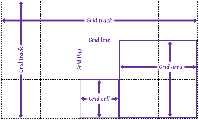
- 网格轨道(grid track)是两个相邻的网格线之间的连续轨道。列轨道其实是块轴轨道,行轨道其实是内联轨道。
- 网格单元(grid cell)是由四条网格线围绕的空间,没有网格线贯穿其中,类似于表格单元。它不能直接用 CSS 网格属性来处理。
- 网格区域(grid area)是由四条网格线围成的矩形区域,由一个或多个网格单元组成。它可以使用 CSS 网格属性来处理,并将网格项与它们关联。
值得注意的是网格项并不是与网格区域强关联的,网格区域可以不放网格项。网格区域可以重叠,也就是它们共用网格单元,对应的网格项也就可以重叠了。
三、放置网格线
grid-template-rows与grid-template-columns是用于定义(放置)网格线的,取值是none | <track-list> | <auto-track-list>。其中none表示不明确的网格(默认值),所有的行和其大小都将由grid-auto-rows属性隐式的指定。<track-list> | <auto-track-list>就比较复杂了,后面会一一介绍。
网格线是可以进行命名的,使用数字编号或者其他字词,也是可以数字和字词混用也就是有多个名字,不过要注意网格线不要重复命名(分属于行和列的可以重复)。
3.1 固定轨道
让grid-template-rows和grid-template-columns取相对固定的值。非负值的长度大小<length>,非负值且相对于网格容器的<percentage>。
这里说的“固定”意思是网格线之间的距离不随网格轨道中内容的变化而变化。
html
<html>
  <head>
    <style>
      .grid {
        display: inline-grid;
        /* 固定宽度,并且给网格线进行命名 */
        grid-template-columns: [start col-a] 200px [col-b] 50% [col-c] 100px [stop end last];
        /* 固定宽度,并且给网格线进行命名。可以将其中的80%换成minmax(300px, 400px) */
        grid-template-rows: [start masthead] 50px [content] 80% [footer] 30px [stop end];
        width: 700px;
        height: 400px;
        border: 1px solid;
      }
      .gridlines {
        text-align: center;
        border: 1px dashed;
      }
      ul li {
        display: flex;
      }
      ul li i {
        color: rebeccapurple;
      }
      .labels1 {
        display: grid;
        grid-template-columns: 200px 50% 100px 50px;
        width: 700px;
        padding: 0;
        margin-bottom: 0;
      }
      .labels1 li {
        justify-content: flex-end;
        align-items: start;
        flex-flow: column;
        border-left: 1px solid;
      }
      .labels2 {
        display: inline-grid;
        grid-template-rows: 50px 80% 30px;
        height: 400px;
        padding: 0;
        margin-left: 0;
        margin-top: 0;
        vertical-align: top;
      }
      .labels2 li {
        border-top: 1px solid;
      }
      .labels2 li i::after {
        content: " || ";
        margin-right: 4px;
      }
      .labels2 li i:last-child::after {
        content: "";
      }
    </style>
  </head>
  <body>
    <section>
      <ul class="labels1">
        <li class="col"><i>start</i><i>col-a</i><i>1</i></li>
        <li class="col"><i>col-b</i><i>2</i></li>
        <li class="col"><i>col-c</i><i>3</i></li>
        <li class="col"><i>stop</i><i>end</i><i>last</i><i>4</i></li>
      </ul>
      <div class="grid">
        <span class="gridlines"></span><span class="gridlines"></span> <span class="gridlines"></span
        ><span class="gridlines"></span> <span class="gridlines"></span><span class="gridlines"></span>
        <span class="gridlines"></span><span class="gridlines"></span>
        <span class="gridlines"></span>
      </div>
      <ul class="labels2">
        <li class="col"><i>start</i><i>masthead</i><i>1</i></li>
        <li class="col"><i>content</i><i>2</i></li>
        <li class="col"><i>footer</i><i>3</i></li>
        <li class="col"><i>stop</i><i>end</i><i>4</i></li>
      </ul>
    </section>
  </body>
</html>
代码效果图: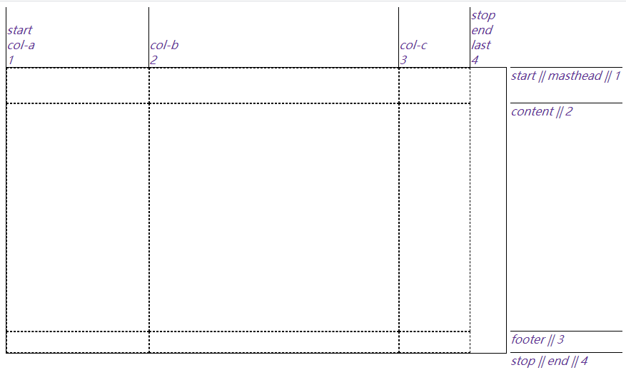
上面这个例子里第二列的宽度是网格容器的一半大小,虽然会随着网格容器宽度而变化,但不会根据网格项的内容而变化。
如果第二行 content 的高度为100%,它会将第三行挤出网格容器,这不会我们想要的结果,那么可以使用minmax(a, b)来约束第二行 content 的高度,其中“a”是最小尺寸,“b”是最大尺寸。grid-template-rows: [start masthead] 50px [content] minmax(320px, 100%) [footer] 30px [stop end];
minmax(a, b)中,如果“b”小于“a”,“b”将会被抛弃,“a”会作为固定值使用。觉得minmax(a, b)不好用那可以试试calc()。
3.2 弹性轨道
让grid-template-rows与grid-template-columns取比较灵活的值,fr单位就可以将可用(剩余)空间按照比例进行分配。例如grid-template-columns: 1fr 1fr 1fr 1fr;相当于grid-template-columns: 25% 25% 25% 25%;。另外就是固定轨道和弹性轨道混搭使用,可以看下面的例子
html
<html>
  <head>
    <style>
      section {
        position: relative;
      }
      .grid {
        display: grid;
        width: 800px;
        height: 15em;
        grid-template-columns: 15em 4.5fr 3fr 10%;
        grid-template-rows: 1fr;
        border: 1px solid;
      }
      .gridlines {
        display: grid;
        border: 1px dashed;
      }
      .gridlines i {
        height: 1.2em;
      }
      .gridlines i.col.measure {
        align-self: center;
        justify-self: stretch;
        text-align: center;
        height: 1.2em;
      }
    </style>
  </head>
  <body>
    <section>
      <div class="grid boxed lines">
        <span class="gridlines"><i class="col measure">15em</i></span>
        <span class="gridlines"><i class="col measure">4.5fr</i></span>
        <span class="gridlines"><i class="col measure">3fr</i></span>
        <span class="gridlines"><i class="col measure">10%</i></span>
      </div>
    </section>
  </body>
</html>
代码效果图: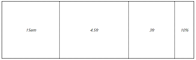
也可以使用minmax(a, b),例如grid-template-columns: 15em 4.5fr 3fr 10%;改为grid-template-columns: 15em 4.5fr minmax(5em, 3fr) 10%;,但要记住fr不能用在 minmax 的第一个参数上。改成grid-template-columns: 15em 1fr minmax(0, 500px) 10%;,如果不考虑边框的话,第一列占据 240px,第二列的1fr实际占据 0(这个是最后算的),第三列是 480px,第四列是 80px。
但是如果第二列里有内容,它就不会是 0px 了。由于第二列的每一项的宽度可能不一致,就需要min-content或max-content来约束。min-content表示内容尽可能窄,对于一段文本来说就是保证最长的单词在一行里,这样会有很多换行。max-content表示内容尽可能宽,对于一段文本来说就是不换行。如果每一列都使用max-content,那很有可能导致网格元素溢出,所以max-content经常搭配minmax(a, b)来使用(但可能会发生重叠)。
html
<html>
  <head>
    <style>
      .grid {
        display: grid;
        width: 250px;
        height: 150px;
        grid-template-rows: 1fr;
        border: 1px solid;
      }
      #div1 {
        grid-template-columns:
          max-content max-content
          max-content max-content;
      }
      #div2 {
        grid-template-columns:
          minmax(0, max-content) minmax(0, max-content)
          minmax(0, max-content) minmax(0, max-content);
      }
      .gridlines {
        border: 1px dashed;
      }
      .block {
        width: 50px;
        height: 50px;
        background-color: blue;
        opacity: 0.5;
        margin: 10px;
      }
    </style>
  </head>
  <body>
    <div class="grid" id="div1">
      <div class="gridlines"><div class="block"></div></div>
      <div class="gridlines"><div class="block" style="width: 100px;"></div></div>
      <div class="gridlines"><div class="block"></div></div>
      <div class="gridlines"><div class="block" style="height: 100px;"></div></div>
    </div>
    <br />
    <div class="grid" id="div2">
      <div class="gridlines"><div class="block"></div></div>
      <div class="gridlines"><div class="block" style="width: 100px;"></div></div>
      <div class="gridlines"><div class="block"></div></div>
      <div class="gridlines"><div class="block" style="height: 100px;"></div></div>
    </div>
  </body>
</html>
代码效果图: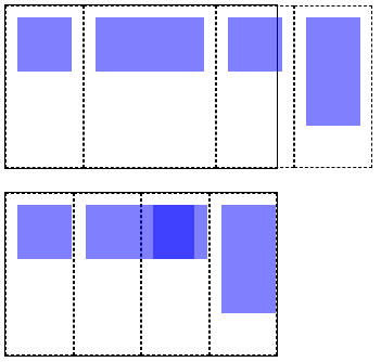
还可以使用auto,一般要么作为最小值要么作为最大值使用。其实使用auto时,是由align-content和justify-content来决定网格元素尺寸的,在后面几节了会讲。
3.3 内容适配轨道
min-content、max-content和minmax(a, b)会比较局限,对每一行内容做不到比较完美的适配。fit-content()函数就比较适合用来适配内容大小的,规范里有这样一个伪公式:fit-content(arg) => min(max-content, max(min-content, arg)),可以理解为取“中间”那个合适的值作为网格尺寸。
html
<html>
  <head>
    <style>
      .grid {
        display: grid;
        grid-template-columns: fit-content(200px) fit-content(200px) fit-content(200px);
        border: 1px solid;
      }
      p {
        border: 1px dotted;
        margin: 0;
        padding: 10px 0;
      }
    </style>
  </head>
  <body>
    <section>
      <div class="grid">
        <p>Short content, 29 characters.</p>
        <p>This is longer content, which reaches a total of 63 characters.</p>
        <p>
          This is still longer content, going on and on, causing line-wraps and the growth of the row’s height as it
          makes its way up to 151 characters in total.
        </p>
      </div>
    </section>
  </body>
</html>
以上代码效果图: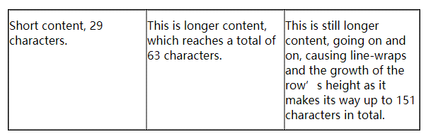
html
<html>
  <head>
    <style>
      .grid {
        display: grid;
        grid-template-columns: fit-content(200px) fit-content(200px) fit-content(200px);
        border: 1px solid;
      }
      p {
        border: 1px dotted;
        margin: 0;
        padding: 10px 0;
      }
      .img {
        width: 250px;
        height: 50px;
        background-color: blue;
      }
    </style>
  </head>
  <body>
    <section>
      <div class="grid">
        <p>Short content, 29 characters.</p>
        <p><img class="img" />This is longer content, which reaches a total of 63 characters.</p>
        <p>
          This is still longer content, going on and on, causing line-wraps and the growth of the row’s height as it
          makes its way up to 151 characters in total.
        </p>
      </div>
    </section>
  </body>
</html>
以上代码效果图: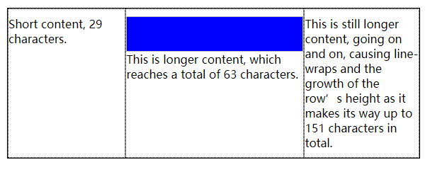
上面第二个例子中有一个 img 图像,第二列的min-content就是 img 的宽度也就是 250px,max-content就是一段文本不换行的长度这里应该是非常大的(估计有 500px)。又因为fit-content(200px),可以带入伪公式:fit-content(200px) => min(500px, max(250px, 200px)),最后结果是 250px。
3.4 重复网格线
我们前面的例子每一列的取值基本一样,其实可以使用repeat()函数来简化。比如要设置 5 个轨道,并且都是 50px 宽,那么可以.grid { display: grid; grid-template-columns: repeat(5, 50px); }。除了单个单个重复的,还能一系列一系列重复的,比如要设置 3 个3em-1fr-1fr,那么可以.grid { display: grid; grid-template-columns: repeat(3, 3em 1fr 1fr); }。
html
<html>
  <head>
    <style>
      section {
        position: relative;
      }
      .grid {
        display: grid;
        width: 800px;
        height: 15em;
        /* grid-template-columns: repeat(3, 3em 1fr 1fr) 3em; 可以平衡两端 */
        grid-template-columns: repeat(3, 3em 1fr 1fr);
        grid-template-rows: 1fr;
        border: 1px solid;
      }
      .gridlines {
        display: grid;
        border: 1px dashed;
      }
      .gridlines i {
        height: 1.2em;
      }
      .gridlines i.col.measure {
        align-self: center;
        justify-self: stretch;
        text-align: center;
        height: 1.2em;
      }
    </style>
  </head>
  <body>
    <section>
      <div class="grid boxed lines">
        <span class="gridlines"><i class="col measure">2em</i></span>
        <span class="gridlines"><i class="col measure">1fr</i></span>
        <span class="gridlines"><i class="col measure">1fr</i></span>
        <span class="gridlines"><i class="col measure">2em</i></span>
        <span class="gridlines"><i class="col measure">1fr</i></span>
        <span class="gridlines"><i class="col measure">1fr</i></span>
        <span class="gridlines"><i class="col measure">2em</i></span>
        <span class="gridlines"><i class="col measure">1fr</i></span>
        <span class="gridlines"><i class="col measure">1fr</i></span>
      </div>
    </section>
  </body>
</html>
以上代码效果图: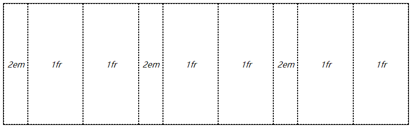
如果网格容器宽度或者高度固定,我们可以使用repeat(auto-fill, xx)自动填充网格,也就是将具体数值替换为auto-fill。这样的写法有个局限就是不能使用在“一系列一系列重复”网格中,也就是只有一个固定尺寸。还可以联合使用比如grid-template-columns: repeat(3, 20em) repeat(auto-fill, 4em);,也可以反过来grid-template-columns: repeat(auto-fill, 4em) repeat(3, 20em);,可以反过来的原因就是始终先算固定尺寸(3 个 20em),再用剩余空间算自动填充的(剩余的一些 4em)。
html
<html>
  <head>
    <style>
      .grid {
        display: grid;
        width: 77em;
        height: 10em;
        border: 1px solid;
        grid-template-columns: repeat(auto-fill, 4em) repeat(3, 20em);
      }
      span {
        border: 1px dashed;
      }
    </style>
  </head>
  <body>
    <div class="grid">
      <span class="gridlines"><i class="col">4em</i></span>
      <span class="gridlines"><i class="col">4em</i></span>
      <span class="gridlines"><i class="col">4em</i></span>
      <span class="gridlines"><i class="col">4em</i></span>
      <span class="gridlines"><i class="col">20em</i></span>
      <span class="gridlines"><i class="col">20em</i></span>
      <span class="gridlines"><i class="col">20em</i></span>
    </div>
  </body>
</html>
以上代码效果图: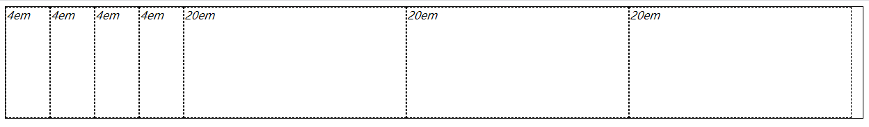
类似的还有repeat(auto-fit, xx),与前面的repeat(auto-fill, xx)功能相同都是自动填充网格,区别就是使用 auto-fit 会剔除不使用的网格轨道(内部没有网格元素)。
html
<html>
  <head>
    <style>
      .grid {
        display: grid;
        width: auto;
        height: 10em;
        border: 1px solid;
      }
      .grid:nth-of-type(1) {
        grid-template-columns: repeat(auto-fit, 10em);
      }
      .grid:nth-of-type(2) {
        grid-template-columns: repeat(auto-fill, 10em);
      }
      span {
        border: 1px dashed;
      }
      .box01 {
        grid-column: 1;
      }
      .box02 {
        grid-column: 2;
      }
      .box03 {
        grid-column: 4;
      }
      .box04 {
        grid-column: 5;
      }
      .box05 {
        grid-column: 7;
      }

      p {
        text-align: center;
        font: bold 1em Consolas, monospace, sans-serif;
        margin: 1ch;
      }
    </style>
  </head>
  <body>
    <section>
      <p>repeat(auto-fit, 20em)</p>
      <div class="grid">
        <span class="box01">1</span>
        <span class="box02">2</span>
        <span class="box03">4</span>
        <span class="box04">5</span>
        <span class="box05">7</span>
      </div>
      <p>repeat(auto-fill, 20em)</p>
      <div class="grid">
        <span class="box01">1</span>
        <span class="box02">2</span>
        <span class="box03">4</span>
        <span class="box04">5</span>
        <span class="box05">7</span>
      </div>
    </section>
  </body>
</html>
3.5 网格区域
grid-template-areas用于给网格划分区域的,直接定义网格区域。可以使用特定的字母或者单词来规定某块区域属于哪一块,比如header、leftside、rightside、centent和footer,也可以使用它们的首字母进行替代。
html
<html>
  <head>
    <style>
      .grid {
        display: grid;
        grid-template-areas:
          "h h h h"
          "l c c r"
          "l f f f";
        grid-template-rows: repeat(3, 3em);
        border: 1px solid;
      }
      span {
        border: 1px dashed;
        text-align: center;
      }
      .header {
        grid-area: h;
      }
      .leftside {
        grid-area: l;
      }
      .rightside {
        grid-area: r;
      }
      .content {
        grid-area: c;
      }
      .footer {
        grid-area: f;
      }
    </style>
  </head>
  <body>
    <div class="grid">
      <span class="box01 header">header</span>
      <span class="box02 content">content</span>
      <span class="box03 leftside">leftside</span>
      <span class="box04 rightside">rightside</span>
      <span class="box05 footer">footer</span>
    </div>
  </body>
</html>
以上代码效果图: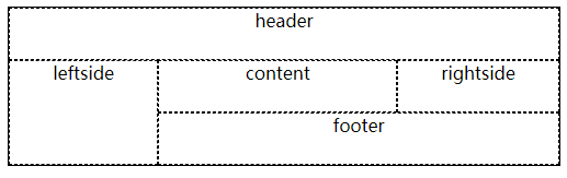
需要注意的一点,grid-template-areas: "h h h h" "l c c r" "l f f f";这样才能跨行,如果是grid-template-areas: "h h h h l c c r l f f f";得到就是一行 12 列的内容了,不会是三行的内容了。还有,跨行或跨列进行合并区域时,只能是矩形,不然 areas 模板会失效。比如grid-template-areas: "h h h h" "l c c r" "l l f f";就不会起作用。
网格区域还是需要网格线来约束大小的,可以看下面这个例子。其中空单元格可以使用...或者.来标记
html
<html>
  <head>
    <style>
      .grid {
        display: grid;
        grid-template-areas:
          "header  header  header  header"
          "left    ... ... right"
          "footer  footer  footer  footer";
        grid-template-columns: 1fr 100px 100px 1fr;
        grid-template-rows: 40px 100px 40px;
        border: 1px solid;
        width: 500px;
      }
      span {
        border: 1px dashed;
      }
      .header {
        grid-area: header;
      }
      .leftside {
        grid-area: left;
      }
      .rightside {
        grid-area: right;
      }
      .content {
        grid-area: content;
      }
      .footer {
        grid-area: footer;
      }
    </style>
  </head>
  <body>
    <div class="grid boxed lines small">
      <span class="header">header</span>
      <span class="leftside">left</span>
      <span class="rightside">right</span>
      <span class="footer">footer</span>
      <span class="gridlines"></span>
      <span class="gridlines"></span>
    </div>
  </body>
</html>
以上代码效果图: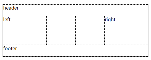
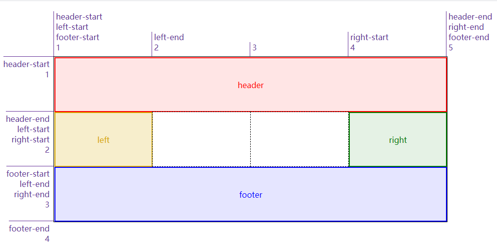
给网格区域命名后,会自动给区域首尾的网格线命名了。比如 header 区域,第一行网格线和第一列网格线的名字都是header-start,第二行网格线和第二列网格线的名字都是header-end
四、添加网格元素
4.1 附加到网格线上
将元素附加到网格线上有四个属性grid-row-start、grid-row-end、grid-column-start和grid-column-end,可以理解为给元素的边界限定范围
html
<html>
  <head>
    <style>
      .grid {
        display: grid;
        width: 50em;
        height: 25em;
        grid-template-row: repeat(3, 5em);
        grid-template-columns: repeat(3, 5em);
      }
      .box01 {
        grid-row-start: 2;
        grid-row-end: 4;
        grid-column-start: 1;
        grid-column-end: 3;
        background: skyblue;
      }
      .box02 {
        grid-row-start: 1;
        grid-row-end: 3;
        grid-column-start: 4;
        grid-column-end: 7;
        background: gray;
      }
      .box03 {
        grid-row-start: 2;
        grid-row-end: 3;
        grid-column-start: 8;
        grid-column-end: 9;
        background: yellow;
      }
      span {
        border: 1px dashed;
      }
      span[class*="box"] {
        z-index: 1;
      }
    </style>
  </head>
  <body>
    <div class="grid boxed gridlines">
      <span class="box01">1</span><span class="box02">2</span><span class="box03">3</span>
      <span class="gridlines"></span><span class="gridlines"></span><span class="gridlines"></span>
      <span class="gridlines"></span><span class="gridlines"></span><span class="gridlines"></span>
      <span class="gridlines"></span><span class="gridlines"></span><span class="gridlines"></span>
      <span class="gridlines"></span><span class="gridlines"></span><span class="gridlines"></span>
      <span class="gridlines"></span>
    </div>
  </body>
</html>
以上代码效果图: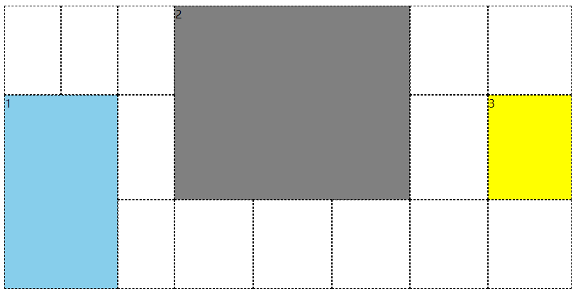
还有一种类似的方式,给它指定跨网格轨道的数量,比如grid-column-start: 3; grid-column-end: span 2;从第三个列线开始往 end 方向跨 2 个 span。其中 span 后面的数值要是正整数,或者省略就是默认为 1。如果是grid-column-start: span 2; grid-column-end: 3;,已第三列线为结束边界,往 start 方向跨 2 个 span(也就是第 1 列线的位置)。
html
<html>
  <head>
    <style>
      #grid {
        display: grid;
        width: 50em;
        height: 25em;
        grid-rows: repeat(4, 2em);
        grid-columns: repeat(5, 5em);
      }
      .box01 {
        grid-row: 1;
        grid-column-start: 3;
        grid-column-end: span 2;
        background: skyblue;
      }
      .box02 {
        grid-row: 2;
        grid-column-start: span 2;
        grid-column-end: 3;
        background: gray;
      }
      .box03 {
        grid-row: 3;
        grid-column-start: 1;
        grid-column-end: span 5;
        background: yellow;
      }
      .box04 {
        grid-row: 4;
        grid-column-start: span 1;
        grid-column-end: 5;
        background: green;
      }
      span {
        border: 1px dashed;
      }
      span[class*="box"] {
        z-index: 1;
      }
    </style>
  </head>
  <body>
    <div class="grid boxed gridlines" id="grid">
      <span class="box01">1</span><span class="box02">2</span><span class="box03">3</span> <span class="box04">4</span
      ><span class="gridlines"></span><span class="gridlines"></span> <span class="gridlines"></span
      ><span class="gridlines"></span><span class="gridlines"></span> <span class="gridlines"></span
      ><span class="gridlines"></span><span class="gridlines"></span> <span class="gridlines"></span
      ><span class="gridlines"></span>
    </div>
  </body>
</html>
以上代码效果图: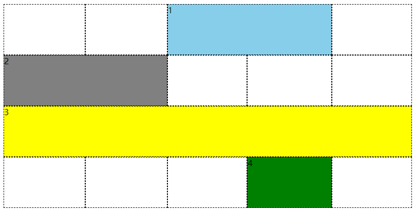
添加元素引用网格线时,并不限于使用编号,网格名称也是可以使用的,混用也可以。可以看下面的例子,R 2、col-A 3和col-A -2是编号和名称混用的场景,编号是可以使用负数的,它表示从网格右侧往左计数(尾端反向计数,尾端-1 就是最后一个),那么col-A -2的意思是从右往左数第 2 个 col-A。
html
<html>
<head>
<style>
    body {width: 64em; padding: 5em; margin: 1px;}
    #grid {display: grid; width: 54em;
        grid-template-rows: repeat(5, [R] 4em);
        grid-template-columns: 2em repeat(5, [col-A] 5em [col-B] 5em);}
    .one { grid-row-start: R 2; grid-row-end: 4;
        grid-column-start: col-B; grid-column-end: span 2; background: skyblue; }
    .two { grid-row-start: R; grid-row-end: span R 2;
        grid-column-start: col-A 3; grid-column-end: span 2 col-A; background: gray; }
    .three { grid-row-start: 4; grid-column-start: col-A -2; background: yellow; }

    span[class*="box"] {z-index: 1;}
    span { border: 1px dashed; }

    .labels#col {display: grid; grid-template-rows: 5em; grid-template-columns: 2em repeat(5, [col-A] 5em [col-B] 5em) 2em 2em;}
    .labels#row {display: grid; grid-template-rows: repeat(6, [R] 4em); grid-template-columns: 5em;}

    .labels#col {position: absolute; top: 0; left: 5em; margin: 0; padding: 1px;}
    .labels#row {position: absolute; top: 5em; left: 0; margin: 0; padding: 1px;}

    .labels#col li {display: flex; justify-content: flex-end; align-items: flex-start; flex-flow: column;}
    .labels#row li {display: flex; justify-content: flex-end; align-items: flex-start; flex-flow: row;}

    .labels li.line.label i {color: rebeccapurple; font: 1em Arvo, sans-serif;}
    .labels#col li.line.label i {border-left: 1px solid; padding-left: 0.25em;}
    .labels#col li i:last-child {padding-bottom: 0.5em;}
    .labels#col li.high i:last-child {padding-bottom: 4em;}

    .labels .line.col.label  {grid-template-row: 1; grid-template-column: auto / span 1;}

    .labels li.line.label i {color: rebeccapurple; font: 1em Arvo, sans-serif;}
    .labels#col li.line.label i {border-left: 1px solid; padding-left: 0.25em;}
    .labels#row li.line.label i {border-top: 1px solid; padding-top: 0.25em;}

    .labels#row li i {padding-right: 0.5em;}
    .labels#col li i:last-child {padding-bottom: 0.5em;}
    .labels#col li.high i:last-child {padding-bottom: 4em;}
</style>
</head>
<body>
    <div class="grid boxed gridlines" id="grid">
        <span class="box01 one">1</span><span class="box02 two">2</span><span class="box03 three">3</span>
        <span class="gridlines"></span><span class="gridlines"></span><span class="gridlines"></span>
        <span class="gridlines"></span><span class="gridlines"></span><span class="gridlines"></span>
        <span class="gridlines"></span><span class="gridlines"></span><span class="gridlines"></span>
        <span class="gridlines"></span><span class="gridlines"></span><span class="gridlines"></span>
        <span class="gridlines"></span><span class="gridlines"></span><span class="gridlines"></span>
        <span class="gridlines"></span><span class="gridlines"></span><span class="gridlines"></span>
        <span class="gridlines"></span><span class="gridlines"></span><span class="gridlines"></span>
        <span class="gridlines"></span><span class="gridlines"></span><span class="gridlines"></span>
        <span class="gridlines"></span><span class="gridlines"></span><span class="gridlines"></span>
        <span class="gridlines"></span><span class="gridlines"></span><span class="gridlines"></span>
        <span class="gridlines">
    </div>
    <ul class="labels" id="col">
        <li class="col line label"><i>1</i></li>
        <li class="col line label"><i>col-A</i><i>2</i></li>
        <li class="col line label"><i>col-B</i><i>3</i></li>
        <li class="col line label"><i>col-A</i><i>4</i></li>
        <li class="col line label"><i>col-B</i><i>5</i></li>
        <li class="col line label"><i>col-A</i><i>6</i></li>
        <li class="col line label"><i>col-B</i><i>7</i></li>
        <li class="col line label"><i>col-A</i><i>8</i></li>
        <li class="col line label"><i>col-B</i><i>9</i></li>
        <li class="col line label"><i>col-A</i><i>10</i></li>
        <li class="col line label"><i>col-B</i><i>11</i></li>
        <li class="col line label"><i>12</i></li>
    </ul>
    <ul class="labels" id="row">
        <li class="row line label"><i></i><i>1</i></li>
        <li class="row line label"><i>R</i><i>2</i></li>
        <li class="row line label"><i>R</i><i>3</i></li>
        <li class="row line label"><i>R</i><i>4</i></li>
        <li class="row line label"><i>R</i><i>5</i></li>
    </ul>
</body>
</html>
以上代码效果图: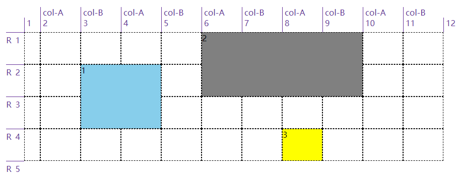
我们可以使用grid-row和grid-column来简写前面提到的四个属性(grid-row-start、grid-row-end、grid-column-start和grid-column-end),需要斜线/来分隔 start 和 end。像这一小节开头的例子可以简写改成以下例子:
html
<html>
  <head>
    <style>
      .grid {
        display: grid;
        width: 50em;
        height: 25em;
        grid-template-row: repeat(3, 5em);
        grid-template-columns: repeat(3, 5em);
      }
      .box01 {
        grid-row: 2 / 4;
        grid-column: 1 / 3;
        background: skyblue;
      }
      .box02 {
        grid-row: 1 / 3;
        grid-column: 4 / 7;
        background: gray;
      }
      .box03 {
        grid-row: 2 / 3;
        grid-column: 8 / 9;
        background: yellow;
      }
      span {
        border: 1px dashed;
      }
      span[class*="box"] {
        z-index: 1;
      }
    </style>
  </head>
  <body>
    <div class="grid boxed gridlines">
      <span class="box01">1</span><span class="box02">2</span><span class="box03">3</span>
      <span class="gridlines"></span><span class="gridlines"></span><span class="gridlines"></span>
      <span class="gridlines"></span><span class="gridlines"></span><span class="gridlines"></span>
      <span class="gridlines"></span><span class="gridlines"></span><span class="gridlines"></span>
      <span class="gridlines"></span><span class="gridlines"></span><span class="gridlines"></span>
      <span class="gridlines"></span>
    </div>
  </body>
</html>
以上代码效果图:
4.2 隐式网格
前面的例子都是使用grid-template-xxx定义的显示网格,在添加元素时一般都在这些网格中,如果万一我们添加的元素超出了这些网格,浏览器会怎么处理?浏览器会自动创建对应的行线或列线。
html
<html>
  <head>
    <style>
      #grid {
        grid-auto-rows: 2em;
        grid-auto-columns: 5em;
        width: 35em;
      }
      #grid {
        display: grid;
        grid-template-rows: 2em 2em;
        grid-template-columns: repeat(6, 4em);
      }
      .box01 {
        grid-column: 1;
        grid-row: 1 / 4;
        border: 5px solid;
        border-color: skyblue;
      }
      .box02 {
        grid-column: 2;
        grid-row: 3 / span 2;
        border: 5px solid;
        border-color: springGreen;
      }
      .box03 {
        grid-column: 3;
        grid-row: span 2 / 3;
        border: 5px solid;
        border-color: salmon;
      }
      .box04 {
        grid-column: 4;
        grid-row: span 4 / 5;
        border: 5px solid;
        border-color: hotPink;
      }
      .box05 {
        grid-column: 5;
        grid-row: span 6 / 5;
        border: 5px solid;
        border-color: lawnGreen;
      }
      .box06 {
        grid-column: 6;
        grid-row: -1 / span 3;
        border: 5px solid;
        border-color: orangeRed;
      }
      .box07 {
        grid-column: 7;
        grid-row: span 3 / -1;
        border: 5px solid;
        border-color: yellowGreen;
      }
      span {
        border: 1px dashed;
      }
      span[class*="box"] {
        z-index: 1;
      }
      span.explicit {
        background: #ddd;
        grid-area: 1 / 1 / 3 / 7;
      }
    </style>
  </head>
  <body>
    <div class="grid gridlines" id="grid">
      <span class="box01">1</span><span class="box02">2</span><span class="box03">3</span> <span class="box04">4</span
      ><span class="box05">5</span><span class="box06">6</span> <span class="box07">7</span
      ><span class="explicit"></span><span class="gridlines"></span> <span class="gridlines"></span
      ><span class="gridlines"></span><span class="gridlines"></span> <span class="gridlines"></span
      ><span class="gridlines"></span><span class="gridlines"></span> <span class="gridlines"></span
      ><span class="gridlines"></span><span class="gridlines"></span> <span class="gridlines"></span
      ><span class="gridlines"></span><span class="gridlines"></span> <span class="gridlines"></span
      ><span class="gridlines"></span><span class="gridlines"></span> <span class="gridlines"></span
      ><span class="gridlines"></span><span class="gridlines"></span> <span class="gridlines"></span
      ><span class="gridlines"></span><span class="gridlines"></span>
    </div>
  </body>
</html>
以上代码效果图: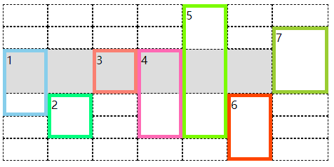
我们可以看到上面这个例子,显示规划了两行六列的网格,7 个 span 中只有第 3 个没有超出,其他都超出了,浏览器自动为它们添加了行线或列线。值得注意的是第 6 个和第 7 个的-1指的是显示网格中尾端反向的网格线(这里就是首端正向第 3 条行线)。
前面的网格线都没有具体的名称,如果有具体的名称情况与上面的类似,主要就是在扩展隐式网格时还能为隐式网格线添加名字。比如下面这个例子中的box01,从2开始往下跨 span 类型的网格,要跨 2 条名称为end的网格线,但显示网格中只有一条end网格线,然后浏览器隐式生成一条end网格线(在下图中是斜体的)。同样box02,从2开始往下跨 span 类型的网格,要跨 1 条名称为final的网格线,但显示网格中没有,那将之前的隐式end网格线又新添一个名字final。后面的box03、box04和box05都是如此。
html
<html>
  <head>
    <style>
      body {
        width: 64em;
        padding-left: 8.4em;
        padding-top: 1em;
        margin: 1px;
      }
      #grid {
        grid-auto-rows: 2em;
        grid-auto-columns: 5em;
        width: 35em;
        left: 5em;
      }
      #grid {
        display: grid;
        grid-template-rows: [begin] 2em [middle] 2em [end];
        grid-template-columns: repeat(5, 5em);
      }
      .box01 {
        grid-column: 1;
        grid-row: 2 / span end 2;
        border: 5px solid;
        border-color: skyblue;
      }
      .box02 {
        grid-column: 2;
        grid-row: 2 / span final;
        border: 5px solid;
        border-color: springGreen;
      }
      .box03 {
        grid-column: 3;
        grid-row: 1 / span 3 middle;
        border: 5px solid;
        border-color: salmon;
      }
      .box04 {
        grid-column: 4;
        grid-row: span begin 2 / end;
        border: 5px solid;
        border-color: hotPink;
      }
      .box05 {
        grid-column: 5;
        grid-row: span 2 middle / begin;
        border: 5px solid;
        border-color: lawnGreen;
      }
      span {
        border: 1px dashed;
      }
      span[class*="box"] {
        z-index: 1;
      }
      span.explicit {
        background: #ddd;
        grid-area: 1 / 1 / 3 / 6;
      }

      .labels#row {
        display: grid;
        grid-template-rows: repeat(7, 2em);
      }
      .labels#row {
        position: absolute;
        top: 1em;
        left: 0;
        margin: 0;
        padding: 1px;
      }
      .labels#row li {
        display: flex;
        justify-content: flex-end;
        align-items: flex-start;
        flex-flow: row;
      }

      .labels li.line.label i {
        color: rebeccapurple;
        font: 1em Arvo, sans-serif;
      }
      .labels li.line.label.implicit i {
        font-style: italic;
      }
      .labels#row li.line.label i {
        border-top: 1px solid;
        padding-top: 0.25em;
      }
      .labels#row li i {
        padding-right: 0.5em;
      }
      .labels li i::after {
        content: " || ";
        margin-right: 4px;
      }
      .labels li i:last-child::after {
        content: "";
      }
    </style>
  </head>
  <body>
    <div class="grid gridlines" id="grid">
      <span class="box01">1</span><span class="box02">2</span><span class="box03">3</span> <span class="box04">4</span
      ><span class="box05">5</span><span class="explicit"></span> <span class="gridlines"></span
      ><span class="gridlines"></span><span class="gridlines"></span> <span class="gridlines"></span
      ><span class="gridlines"></span><span class="gridlines"></span> <span class="gridlines"></span
      ><span class="gridlines"></span><span class="gridlines"></span> <span class="gridlines"></span
      ><span class="gridlines"></span><span class="gridlines"></span>
      <span class="gridlines"></span>
    </div>
    <ul class="labels" id="row">
      <li class="row line label implicit"><i>middle</i></li>
      <li class="row line label implicit"><i>begin</i><i>middle</i></li>
      <li class="row line label"><i>begin</i><i>1</i></li>
      <li class="row line label"><i>middle</i><i>2</i></li>
      <li class="row line label"><i>end</i><i>3</i></li>
      <li class="row line label implicit"><i>final</i><i>middle</i></li>
      <li class="row line label implicit"><i>middle</i></li>
    </ul>
  </body>
</html>
以上代码效果图: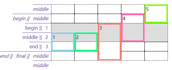
我们并没讲隐式添加的网格的尺寸为什么和显式的一样,因为上面的例子都使用了grid-auto-rows或grid-auto-columns来约束隐式网格尺寸,如果不使用这两个属性,那么新添的行的高度会根据这一行的内容高度作为最终高度,新添加的列的宽度会根据这一列的内容宽度作为最终宽度。这个同样也应用于网格流中,看下面这个例子。
html
<html>
  <head>
    <style>
      .grid {
        display: inline-grid;
        vertical-align: top;
        margin-right: 3em;
        grid-template-rows: 120px 120px;
        grid-template-columns: 120px 120px;
      }
      #g1 {
        grid-auto-rows: 120px;
      }
      span[class*="box"] {
        font-size: 1.5em;
        border: 5px solid;
      }
      *[class*="01"] {
        color: hsl(0, 67%, 50%);
        background: hsla(0, 67%, 50%, 0.2);
        border-color: skyblue;
      }
      *[class*="02"] {
        color: hsl(24, 67%, 50%);
        background: hsla(24, 67%, 50%, 0.2);
        border-color: salmon;
      }
      *[class*="03"] {
        color: hsl(48, 67%, 50%);
        background: hsla(48, 67%, 50%, 0.2);
        border-color: hotPink;
      }
      *[class*="04"] {
        color: hsl(72, 67%, 50%);
        background: hsla(72, 67%, 50%, 0.2);
        border-color: lawnGreen;
      }
      *[class*="05"] {
        color: hsl(96, 67%, 50%);
        background: hsla(96, 67%, 50%, 0.2);
        border-color: blueViolet;
      }
      *[class*="06"] {
        color: hsl(120, 67%, 50%);
        background: hsla(120, 67%, 50%, 0.2);
        border-color: burlyWood;
      }
    </style>
  </head>
  <body>
    <div class="grid boxed gridlines" id="g1">
      <span class="box01">1</span><span class="box02">2</span><span class="box03">3</span> <span class="box04">4</span
      ><span class="box05">5</span><span class="box06">6</span>
    </div>
    <div class="grid boxed gridlines" id="g2">
      <span class="box01">1</span><span class="box02">2</span><span class="box03">3</span> <span class="box04">4</span
      ><span class="box05">5</span><span class="box06">6</span>
    </div>
  </body>
</html>
以上代码效果图: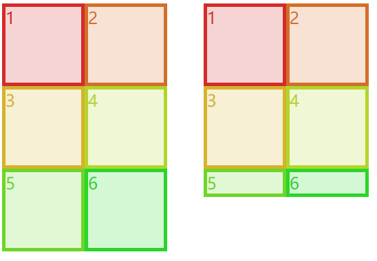
4.3 附加到网格区域中
事先定义好网格区域,直接使用grid-area可以将元素添加到网格区域中。其实在网格区域这节的例子里就使用了grid-area,如下。
html
<html>
  <head>
    <style>
      .grid {
        display: grid;
        grid-template-areas:
          "h h h h"
          "l c c r"
          "l f f f";
        grid-template-rows: repeat(3, 3em);
        border: 1px solid;
      }
      span {
        border: 1px dashed;
        text-align: center;
      }
      .header {
        grid-area: h;
      }
      .leftside {
        grid-area: l;
      }
      .rightside {
        grid-area: r;
      }
      .content {
        grid-area: c;
      }
      .footer {
        grid-area: f;
      }
    </style>
  </head>
  <body>
    <div class="grid">
      <span class="box01 header">header</span>
      <span class="box02 content">content</span>
      <span class="box03 leftside">leftside</span>
      <span class="box04 rightside">rightside</span>
      <span class="box05 footer">footer</span>
    </div>
  </body>
</html>
以上代码效果图:
以上只是grid-area为一个值的场景,有些场景下它有 4 个值并用/分隔。比如下面例子中的grid-area: 1 / 1 / 2 / 2,就是上 / 左 / 下 / 右的网格线顺序,与 css 属性的上右下左是反的。
html
<html>
  <head>
    <style>
      #grid {
        width: 400px;
        height: 150px;
      }
      #grid {
        display: inline-grid;
        grid-template-rows: [r1-start] 1fr [r1-end r2-start] 2fr [r2-end];
        grid-template-columns: [col-start] 1fr [col-end main-start] 1fr [main-end];
      }
      .box01 {
        grid-area: r1 / main / r1 / main;
        border: 5px solid;
        border-color: skyblue;
      }
      .box02 {
        grid-area: r2-start / col-start / r2-end / main-end;
        border: 5px solid;
        border-color: springGreen;
      }
      .box03 {
        grid-area: 1 / 1 / 2 / 2;
        border: 5px solid;
        border-color: salmon;
      }
      span {
        border: 1px dashed;
        text-align: center;
      }
      ul li {
        display: flex;
      }
      ul li i {
        color: rebeccapurple;
      }
      .labels1 {
        display: grid;
        grid-template-columns: 1fr 1fr 1fr;
        width: 600px;
        padding: 0;
        margin-bottom: 0;
        margin-left: 160px;
      }
      .labels1 li {
        justify-content: flex-end;
        align-items: flex-start;
        flex-flow: column;
        border-left: 1px solid;
      }
      .labels2 {
        display: inline-grid;
        grid-template-rows: 1fr 2fr 1fr;
        height: 200px;
        padding: 0;
        margin-left: 0;
        margin-top: 0;
        vertical-align: top;
      }
      .labels2 li {
        border-top: 1px solid;
        justify-content: flex-end;
      }
      .labels2 li i::after {
        content: " || ";
        margin-right: 4px;
      }
      .labels2 li i:last-child::after {
        content: "";
      }
    </style>
  </head>
  <body>
    <ul class="labels1">
      <li class="col"><i>col-start</i><i>1</i></li>
      <li class="col"><i>col-end</i><i>main-start</i><i>2</i></li>
      <li class="col"><i>main-end</i><i>3</i></li>
    </ul>
    <ul class="labels2">
      <li class="col"><i>r1-start</i><i>1</i></li>
      <li class="col"><i>r1-end</i><i> r2-start</i><i>2</i></li>
      <li class="col"><i>r2-end</i><i>3</i></li>
    </ul>
    <div class="grid boxed gridlines" id="grid">
      <span class="box01 one" id="masthead">box01</span>
      <span class="box02 two" id="sidebar">box02</span>
      <span class="box03 three" id="main">box03</span>
    </div>
  </body>
</html>
以上代码效果图: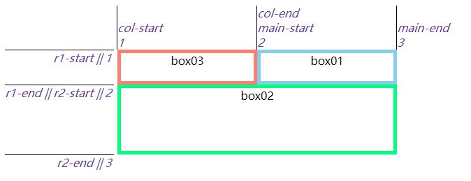
4.4 元素重叠以及异常处理
将元素添加到网格中时,元素是可以重叠的(可以是可以但要避免出现这样的情况)。
html
<html>
  <head>
    <style>
      #grid {
        width: 54em;
        height: 17em;
        border: 1px solid;
      }
      #grid {
        display: grid;
        grid-template-rows: 50% 50%;
        grid-template-columns: 50% 50%;
      }
      .box01 {
        grid-area: 1 / 1 / 2 / 3;
        border: 5px solid;
        border-color: hotPink;
      }
      .box02 {
        grid-area: 1 / 2 / 3 / 2;
        border: 5px solid;
        border-color: skyblue;
      }
      span {
        border: 1px dashed;
      }
    </style>
  </head>
  <body>
    <div class="grid boxed gridlines" id="grid">
      <span class="box01 one" id="masthead">1</span>
      <span class="box02 two" id="sidebar">2</span>
    </div>
  </body>
</html>
以上代码效果图:
不只是在数字引用的网格线下添加元素出现重叠的现象,网格区域也是同样的。后添加的会遮住先添加的。
html
<html>
  <head>
    <style>
      #grid {
        width: 50em;
        height: 15em;
        border: 1px solid;
        grid-template-columns: 1fr 3fr;
        grid-template-rows: 4em 7em 4em;
      }
      #grid {
        display: grid;
        grid-template-areas:
          "header header"
          "sidebar content"
          "footer footer";
      }
      #header {
        grid-area: header;
        border: 5px solid;
        border-color: skyblue;
      }
      #sidebar {
        grid-area: sidebar / sidebar / footer-end / sidebar;
        border: 5px solid;
        border-color: springGreen;
      }
      #footer {
        grid-area: footer;
        border: 5px solid;
        border-color: salmon;
      }
    </style>
  </head>
  <body>
    <div class="grid boxed gridlines" id="grid">
      <span class="box01 one" id="header">header</span>
      <span class="box02 two" id="sidebar">sidebar</span>
      <span class="box03" id="footer">footer</span>
    </div>
  </body>
</html>
以上代码效果图:
添加元素时的异常处理:
开始线数值大于结束线数值
grid-row-start: 5; grid-row-end: 2;会自动转变为grid-row-start: 2; grid-row-end: 5;开始线和结束线都声明为跨度
grid-row-start: span; grid-row-end: span 3;,结束线的跨度会被忽略,会转变为grid-row-start: span 1; grid-row-end: auto;,然后根据网格流自动放置,后面小节会讲。只用具名跨度指明网格元素位置
grid-row-start: span footer; grid-row-end: auto;,这个和上面说的隐式网格很像,但是不一样,因为有个auto。这种情况也是会转变为grid-row-start: span 1; grid-row-end: auto;grid-area四个值缺少一两个 开始线值是网格线名称,缺少的结束线值与开始线值相同;开始线值是数值,缺少的结束线值则是auto
五、网格流
5.1 行优先和列优先
如果不明确指定网格元素在网格中的位置的话,网格元素会在网格流的作用下自动放在网格中合适的位置。网格流grid-auto-flow有两种模式:行优先和列优先。所谓“行优先”就是尽量占满一行再去排列下一行,“列优先”就是尽量先占满一列。
html
<html>
  <head>
    <style>
      .grid {
        grid-template-columns: repeat(3, 200px);
        grid-template-rows: repeat(2, 50px);
        border: 1px solid;
      }
      .grid {
        display: grid;
        width: 600px;
        height: 100px;
        grid-auto-flow: column /*row*/;
      }
      .grid li {
        grid-row: auto;
        grid-column: auto;
      }
      ol {
        list-style: none;
        padding: 0;
      }
      .box01 {
        border: 5px solid;
        border-color: skyblue;
      }
      .box02 {
        border: 5px solid;
        border-color: springGreen;
      }
      .box03 {
        border: 5px solid;
        border-color: salmon;
      }
      .box04 {
        border: 5px solid;
        border-color: hotPink;
      }
      .box05 {
        border: 5px solid;
        border-color: lawnGreen;
      }
    </style>
  </head>
  <body>
    <ol class="grid">
      <li class="box01">1</li>
      <li class="box02">2</li>
      <li class="box03">3</li>
      <li class="box04">4</li>
      <li class="box05">5</li>
    </ol>
  </body>
</html>
以上代码效果图:
可以看到上面的例子使用的是grid-row: auto; grid-column: auto;,因为默认每个网格元素一样大。但是如果每个网格元素的尺寸不一(并且大于网格区域的大小),再这样写就不合适了,必须给尺寸过大的网格元素添加跨度。
html
<html>
  <head>
    <style>
      #grid {display: grid;
          grid-template-rows: repeat(4, 50px);
          grid-template-columns: repeat(4, 50px);
          grid-auto-rows: 50px;
          grid-auto-columns: 50px;
      }
      img {grid-row: auto; grid-column: auto;}
      img {width: 50px; height; 50px; border: 1px solid silver; box-sizing: border-box;}
      img.wide {width: 90px; height: 50px;}
      img.tall {width: 50px; height: 90px;}
      img.big {width: 90px; height: 90px;}
      img.wide {grid-column: auto / span 2;}
      img.tall {grid-row: auto / span 2;}
      img.big {grid-row: auto / span 2; grid-column: auto / span 2;}
    </style>
  </head>
  <body>
    <div id="grid">
      <img src="./yinyang.png" alt="" class="" />
      <img src="./yinyang.png" alt="" class="wide" />
      <img src="./yinyang.png" alt="" class="" />
      <img src="./yinyang.png" alt="" class="tall" />
      <img src="./yinyang.png" alt="" class="" />
      <img src="./yinyang.png" alt="" class="" />
      <img src="./yinyang.png" alt="" class="big" />
      <img src="./yinyang.png" alt="" class="wide" />
      <img src="./yinyang.png" alt="" class="" />
      <img src="./yinyang.png" alt="" class="" />
      <img src="./yinyang.png" alt="" class="" />
      <img src="./yinyang.png" alt="" class="" />
    </div>
  </body>
</html>
以上代码效果图: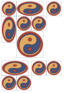
5.2 网格流和浮动的区别
你会发现上面的例子上留出了很多间隙,原因是留出的空间放不下后面紧接着的元素了,就算能放下也不能超出前面元素的顶边。是不是觉得网格流和浮动有些像,但是浮动要比网格流规则更复杂。情况稍有不同,可以看下面例子中的 13 号元素的位置,想一想为什么。
html
<html>
  <head>
    <style>
      span {
        box-sizing: border-box;
      }

      .float {
        display: inline-block;
        width: 320px;
        height: 320px;
      }
      .float span {
        float: left;
        width: 80px;
        height: 80px;
      }
      .float span.wide {
        width: 160px;
      }
      .float span.tall {
        height: 160px;
      }

      .grid {
        display: inline-grid;
        grid-template-columns: repeat(4, 80px);
        grid-template-rows: repeat(4, 80px);
        grid-auto-columns: 80px;
        grid-auto-rows: 80px;
        vertical-align: top;
        margin-left: 200px;
      }
      .grid {
        grid-auto-flow: row;
      }
      .grid span {
        align-items: start;
        padding-top: 0.25em;
      }
      .grid span.wide {
        grid-column: auto / span 2;
      }
      .grid span.tall {
        grid-row: auto / span 2;
      }

      span[class*="box"] {
        font-size: 1.5em;
        border: 5px solid;
      }
      *[class*="01"] {
        color: hsl(0, 67%, 50%);
        background: hsla(0, 67%, 50%, 0.2);
        border-color: skyblue;
      }
      *[class*="02"] {
        color: hsl(24, 67%, 50%);
        background: hsla(24, 67%, 50%, 0.2);
        border-color: salmon;
      }
      *[class*="03"] {
        color: hsl(48, 67%, 50%);
        background: hsla(48, 67%, 50%, 0.2);
        border-color: hotPink;
      }
      *[class*="04"] {
        color: hsl(72, 67%, 50%);
        background: hsla(72, 67%, 50%, 0.2);
        border-color: lawnGreen;
      }
      *[class*="05"] {
        color: hsl(96, 67%, 50%);
        background: hsla(96, 67%, 50%, 0.2);
        border-color: blueViolet;
      }
      *[class*="06"] {
        color: hsl(120, 67%, 50%);
        background: hsla(120, 67%, 50%, 0.2);
        border-color: burlyWood;
      }
      *[class*="07"] {
        color: hsl(144, 67%, 50%);
        background: hsla(144, 67%, 50%, 0.2);
        border-color: chartreuse;
      }
      *[class*="08"] {
        color: hsl(168, 67%, 50%);
        background: hsla(168, 67%, 50%, 0.2);
        border-color: chocolate;
      }
      *[class*="09"] {
        color: hsl(192, 67%, 50%);
        background: hsla(192, 67%, 50%, 0.2);
        border-color: cornflowerBlue;
      }
      *[class*="10"] {
        color: hsl(216, 67%, 50%);
        background: hsla(216, 67%, 50%, 0.2);
        border-color: cyan;
      }
      *[class*="11"] {
        color: hsl(240, 67%, 50%);
        background: hsla(240, 67%, 50%, 0.2);
        border-color: darkGoldenRod;
      }
      *[class*="12"] {
        color: hsl(264, 67%, 50%);
        background: hsla(264, 67%, 50%, 0.2);
        border-color: darkMagenta;
      }
      *[class*="13"] {
        color: hsl(288, 67%, 50%);
        background: hsla(288, 67%, 50%, 0.2);
        border-color: darkorange;
      }
      *[class*="14"] {
        color: hsl(312, 67%, 50%);
        background: hsla(312, 67%, 50%, 0.2);
        border-color: darkOrchid;
      }
      *[class*="15"] {
        color: hsl(336, 67%, 50%);
        background: hsla(336, 67%, 50%, 0.2);
        border-color: darkSalmon;
      }
      *[class*="16"] {
        color: hsl(360, 67%, 50%);
        background: hsla(360, 67%, 50%, 0.2);
        border-color: feldspar;
      }
    </style>
  </head>
  <body>
    <div class="float">
      <span class="box01">1</span><span class="box02 wide">2</span><span class="box03">3</span>
      <span class="box04">4</span><span class="box05">5</span><span class="box06">6</span> <span class="box07">7</span
      ><span class="box08 tall">8</span><span class="box09">9</span> <span class="box10">10</span
      ><span class="box11 wide tall">11</span><span class="box12">12</span> <span class="box13">13</span
      ><span class="box14">14</span><span class="box15">15</span>
      <span class="box16">16</span>
    </div>
    <div class="grid">
      <span class="box01">1</span><span class="box02 wide">2</span><span class="box03">3</span>
      <span class="box04">4</span><span class="box05">5</span><span class="box06">6</span> <span class="box07">7</span
      ><span class="box08 tall">8</span><span class="box09">9</span> <span class="box10">10</span
      ><span class="box11 wide tall">11</span><span class="box12">12</span> <span class="box13">13</span
      ><span class="box14">14</span><span class="box15">15</span>
      <span class="box16">16</span>
    </div>
  </body>
</html>
以上代码效果图: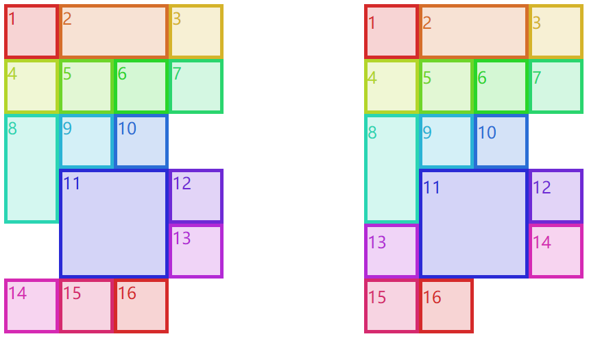
浮动规则中有一条“如果前面元素左浮动,那么后面浮动元素的左边界必定处于前面元素右边界的右侧,除非后面浮动元素的顶边在前面浮动元素的下边”。11 和 12 所在行没有 13 的位置了,11 的左右都有 13 所需要的空间,但是由于前面这条规则,13 只能放在 11 的右侧了。你可能想为什么不与 14、15 和 16 放在一行呢?因为浮动规则中还有一条“满足其他条件后,浮动元素要尽可能上移”,所以 13 只能放在 12 的下面且 11 的右侧了。而网格流并没有这样的限制,它只需要保证“不超出前面元素顶边”就可以了(上面例子的右边这部分里的 13 就可以放在 11 的左侧了,但 12 仍旧和浮动场景一样,不能超过前面元素的顶边)。
5.3 密集流
“不超出前面元素顶边”是为了保证元素编号的不错乱,其实有一种密集流可以让网格元素紧靠着不用管什么编号顺序了,grid-auto-flow: row dense;是行优先的密集流,grid-auto-flow: column dense;是列优先的密集流。下面这个例子左边的 12 才不管前面的顶边在哪,会直接占据上面的空位;同样右边的 11 才不会管前面的左边界在哪,会直接占据左边的空位。
html
<html>
  <head>
    <style>
      span {
        box-sizing: border-box;
      }

      .grid {
        display: inline-grid;
        grid-template-columns: repeat(4, 80px);
        grid-template-rows: repeat(4, 80px);
        grid-auto-columns: 80px;
        grid-auto-rows: 80px;
        vertical-align: top;
        margin-right: 5em;
      }
      #g1 {
        grid-auto-flow: row dense;
      }
      #g2 {
        grid-auto-flow: column dense;
      }

      #g1 span {
        align-items: start;
        padding-top: 0.25em;
      }
      #g2 span {
        justify-content: flex-start;
        padding-left: 0.25em;
      }

      .wide {
        grid-column: auto / span 2;
      }
      .tall {
        grid-row: auto / span 2;
      }

      span[class*="box"] {
        font-size: 1.5em;
        border: 5px solid;
      }
      *[class*="01"] {
        color: hsl(0, 67%, 50%);
        background: hsla(0, 67%, 50%, 0.2);
        border-color: skyblue;
      }
      *[class*="02"] {
        color: hsl(24, 67%, 50%);
        background: hsla(24, 67%, 50%, 0.2);
        border-color: salmon;
      }
      *[class*="03"] {
        color: hsl(48, 67%, 50%);
        background: hsla(48, 67%, 50%, 0.2);
        border-color: hotPink;
      }
      *[class*="04"] {
        color: hsl(72, 67%, 50%);
        background: hsla(72, 67%, 50%, 0.2);
        border-color: lawnGreen;
      }
      *[class*="05"] {
        color: hsl(96, 67%, 50%);
        background: hsla(96, 67%, 50%, 0.2);
        border-color: blueViolet;
      }
      *[class*="06"] {
        color: hsl(120, 67%, 50%);
        background: hsla(120, 67%, 50%, 0.2);
        border-color: burlyWood;
      }
      *[class*="07"] {
        color: hsl(144, 67%, 50%);
        background: hsla(144, 67%, 50%, 0.2);
        border-color: chartreuse;
      }
      *[class*="08"] {
        color: hsl(168, 67%, 50%);
        background: hsla(168, 67%, 50%, 0.2);
        border-color: chocolate;
      }
      *[class*="09"] {
        color: hsl(192, 67%, 50%);
        background: hsla(192, 67%, 50%, 0.2);
        border-color: cornflowerBlue;
      }
      *[class*="10"] {
        color: hsl(216, 67%, 50%);
        background: hsla(216, 67%, 50%, 0.2);
        border-color: cyan;
      }
      *[class*="11"] {
        color: hsl(240, 67%, 50%);
        background: hsla(240, 67%, 50%, 0.2);
        border-color: darkGoldenRod;
      }
      *[class*="12"] {
        color: hsl(264, 67%, 50%);
        background: hsla(264, 67%, 50%, 0.2);
        border-color: darkMagenta;
      }
      *[class*="13"] {
        color: hsl(288, 67%, 50%);
        background: hsla(288, 67%, 50%, 0.2);
        border-color: darkorange;
      }
      *[class*="14"] {
        color: hsl(312, 67%, 50%);
        background: hsla(312, 67%, 50%, 0.2);
        border-color: darkOrchid;
      }
      *[class*="15"] {
        color: hsl(336, 67%, 50%);
        background: hsla(336, 67%, 50%, 0.2);
        border-color: darkSalmon;
      }
      *[class*="16"] {
        color: hsl(360, 67%, 50%);
        background: hsla(360, 67%, 50%, 0.2);
        border-color: feldspar;
      }
    </style>
  </head>
  <body>
    <div class="grid" id="g1">
      <span class="box01">1</span><span class="box02 wide">2</span><span class="box03">3</span>
      <span class="box04">4</span><span class="box05">5</span><span class="box06">6</span> <span class="box07">7</span
      ><span class="box08 tall">8</span><span class="box09">9</span> <span class="box10">10</span
      ><span class="box11 wide tall">11</span><span class="box12">12</span> <span class="box13">13</span
      ><span class="box14">14</span><span class="box15">15</span>
      <span class="box16">16</span>
    </div>
    <div class="grid" id="g2">
      <span class="box01">1</span><span class="box02 wide">2</span><span class="box03">3</span>
      <span class="box04">4</span><span class="box05">5</span><span class="box06">6</span> <span class="box07">7</span
      ><span class="box08 tall">8</span><span class="box09">9</span> <span class="box10 wide tall">10</span
      ><span class="box11">11</span><span class="box12">12</span> <span class="box13">13</span
      ><span class="box14">14</span><span class="box15">15</span>
      <span class="box16">16</span>
    </div>
  </body>
</html>
以上代码效果图: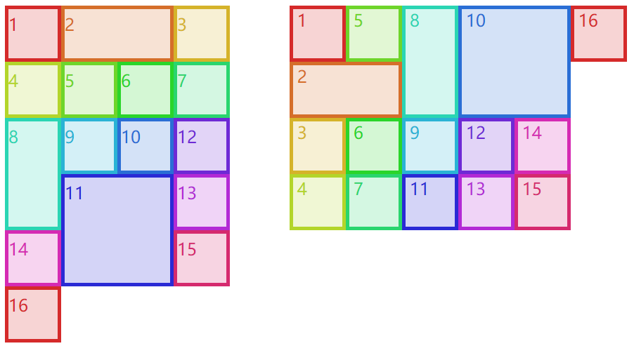
六、元素在网格空间中的布局
6.1 栏距
栏距就是两个网格轨道之间的距离,给网格单元之间添加间隔,与表格布局中的border-spacing很像。具体使用的是grid-row-gap和grid-column-gap,不能取百分比也不能使用fr,只能使用常用的距离单位px、rem等。当然,栏距有简写属性grid-gap: xxx xxx,第一个值就是行间距,第二个字就是列间距。
html
<html>
  <head>
    <style>
      .grid {
        display: grid;
        width: 500px;
        height: 500px;
        border: 1px solid;
        grid-template-rows: 150px 1fr 150px;
        grid-template-columns: 15% 1fr 1fr;
        grid-column-gap: 1em;
        grid-row-gap: 25px;
      }
      span[class*="box"] {
        font-size: 1.5em;
        border: 5px solid;
      }
      *[class*="01"] {
        color: hsl(0, 67%, 50%);
        background: hsla(0, 67%, 50%, 0.2);
        border-color: skyblue;
      }
      *[class*="02"] {
        color: hsl(24, 67%, 50%);
        background: hsla(24, 67%, 50%, 0.2);
        border-color: salmon;
      }
      *[class*="03"] {
        color: hsl(48, 67%, 50%);
        background: hsla(48, 67%, 50%, 0.2);
        border-color: hotPink;
      }
      *[class*="04"] {
        color: hsl(72, 67%, 50%);
        background: hsla(72, 67%, 50%, 0.2);
        border-color: lawnGreen;
      }
      *[class*="05"] {
        color: hsl(96, 67%, 50%);
        background: hsla(96, 67%, 50%, 0.2);
        border-color: blueViolet;
      }
      *[class*="06"] {
        color: hsl(120, 67%, 50%);
        background: hsla(120, 67%, 50%, 0.2);
        border-color: burlyWood;
      }
      *[class*="07"] {
        color: hsl(144, 67%, 50%);
        background: hsla(144, 67%, 50%, 0.2);
        border-color: chartreuse;
      }
      *[class*="08"] {
        color: hsl(168, 67%, 50%);
        background: hsla(168, 67%, 50%, 0.2);
        border-color: chocolate;
      }
      *[class*="09"] {
        color: hsl(192, 67%, 50%);
        background: hsla(192, 67%, 50%, 0.2);
        border-color: cornflowerBlue;
      }
    </style>
  </head>
  <body>
    <div class="grid boxed gridlines" id="g1">
      <span class="box01">1</span><span class="box02">2</span><span class="box03">3</span> <span class="box04">4</span
      ><span class="box05">5</span><span class="box06">6</span> <span class="box05">7</span><span class="box03">8</span
      ><span class="box01">9</span>
    </div>
  </body>
</html>
以上代码效果图:
6.2 网格元素的盒模型
在添加网格元素这节里,我们确定了添加网格元素后它所在区域的空间大小,也就是我们这节所说的网格空间。网格空间可以跨好几个网格单元,网格单元之间由于栏距还可以有间隔,这都是网格空间本身的性质。
网格元素在网格空间里布局时,可能因为网格元素本身的盒模型而让网格元素显示的效果而不同(但不会影响网格空间)。其实可以把它看作是一种父子元素的布局,如果子元素(网格元素)是块级元素,那完全可以使用块级元素的隐藏等式,也就是margin-left + border-left-width + padding-left + width + padding-right + border-right-width + margin-right = the width of the parent element
html
<html>
  <head>
    <style>
      .grid {
        display: grid;
        height: 200px;
        width: 400px;
        border: 1px solid;
        grid-template-rows: repeat(2, 100px);
        grid-template-columns: repeat(2, 200px);
      }
      .box02 {
        margin: 25px;
      }
      .box03 {
        margin: -25px 0;
      }
      span[class*="box"] {
        font-size: 1.5em;
        border: 5px solid;
      }
      *[class*="01"] {
        color: hsl(0, 67%, 50%);
        border-color: skyblue;
      }
      *[class*="02"] {
        color: hsl(24, 67%, 50%);
        border-color: salmon;
      }
      *[class*="03"] {
        color: hsl(48, 67%, 50%);
        border-color: hotPink;
      }
      *[class*="04"] {
        color: hsl(72, 67%, 50%);
        border-color: lawnGreen;
      }
    </style>
  </head>
  <body>
    <div class="grid boxed gridlines" id="g1">
      <span class="box01">1</span><span class="box02">2</span> <span class="box03">3</span><span class="box04">4</span>
    </div>
  </body>
</html>
以上代码效果图:
可以看到上面这个例子,4 个盒子的宽高都是auto,如果都没有内外边距,那么他们都是刚好占满网格空间,box1 和 box4 都是如此。而 box2 和 box3 是带了外边距的,box2 是正值的外边距,又由于网格空间的宽度始终不变,那么 box2 的宽度会往内部缩小;box3 是负值的外边距,又由于网格空间的宽度始终不变,那么 box3 的宽度会往外部增大。宽度也是可以这么解释的。
在块级元素的隐藏等式下,如果宽度固定,左右的外边距会根据具体的情况进行变化。比如,左右外边距都设置了值,按照书写模式一般会舍弃右外边距;如果右外边距设置的是固定值,左外边距设置的是auto,那么左外边距会自动变化;如果左外边距设置的是固定值,右外边距设置的是auto,那么右外边距会自动变化。这些都是盒模型布局中常见的知识了。
6.3 网格元素的绝对定位
其实与块级元素一样,网格元素使用定位时也有一个定位元素的隐藏等式。即使宽高是固定值,“舍弃”以及“auto”与上一节虽然类似但还是比较复杂的,具体可以参考absolute 绝对定位。
html
<html>
  <head>
    <style>
      #grid {
        display: grid;
        width: 500px;
        grid-template-rows: repeat(3, 100px);
        grid-template-columns: repeat(5, 100px);
      }
      span {
        border: 1px dotted red;
      }
      .exel {
        grid-row: 2 / 4;
        grid-column: 2 / 5;
        position: relative;
      }
      .exel i {
        border: 5px solid skyblue;
      }
      .exel i {
        position: absolute;
        top: 10px;
        bottom: 20px;
        left: 30px;
        right: 40px;
      }
    </style>
  </head>
  <body>
    <div class="grid boxed lines" id="grid">
      <span class="gridlines"></span><span class="gridlines"></span> <span class="gridlines"></span
      ><span class="gridlines"></span> <span class="gridlines"></span><span class="gridlines"></span>
      <span class="gridlines"></span><span class="gridlines"></span>
      <span class="gridlines"></span>
      <span class="exel"><i class="box01">exel</i></span>
    </div>
  </body>
</html>
以上代码效果图:
grid-row-end: auto和grid-column-end: auto,这两个对网格元素盒模型和绝对定位是有影响的,情况不好确定,先留在这里等后面有时间再来研究了。
七、网格的对齐方式
网格布局的对齐方式与弹性盒布局的对齐方式十分相像,可以看下表。
| 属性 | 对齐目标 | 适用于 |
|---|---|---|
| justify-self | 行内方向(横向)上的单个网格元素 | 网格元素 |
| justify-items | 行内方向(横向)上的全部网格元素 | 网格容器 |
| justify-content | 行内方向(横向)上的整个网格 | 网格容器 |
| align-self | 块级方向(纵向)上的单个网格元素 | 网格元素 |
| align-items | 块级方向(纵向)上的全部网格元素 | 网格容器 |
| align-content | 块级方向(纵向)上的整个网格 | 网格容器 |
7.1 xxx-self
justify-self(横向)和align-self(纵向)是针对某个网格元素来说的,也就是说它设置在网格元素上的。它们共同拥有 6 个值:
start:让网格元素向网格空间的起边对齐。不受网格空间的direction: xxx;影响,但受到网格容器的direction: xxx;影响。end:让网格元素向网格空间的终边对齐。不受网格空间的direction: xxx;影响,但受到网格容器的direction: xxx;影响。center:在对齐轴上居中对齐。self-start:让网格元素向网格空间的书写模式的起边对齐。只受网格空间本身的direction: xxx;影响。self-end:让网格元素向网格空间的书写模式的终边对齐。只受网格空间本身的direction: xxx;影响。stretch:拉伸,但必须保证网格元素对应的宽或高是auto不然不会进行拉伸。
justify-self独有的 2 个值:
left:横向上就是居左对齐,不受任何direction: xxx;影响。right:横向上就是居右对齐,不受任何direction: xxx;影响。
align-self独有的 1 个值:
baseline:让当前网格元素与同一轨道中最低的那个网格元素的 baseline 进行对齐。
html
<html>
  <head>
    <style>
      body {
        width: auto;
      }
      .grid {
        display: grid;
        padding: 0.5em;
        margin: 0.25em 0 2em;
        grid-gap: 0.75em 0.5em;
      }
      #g1 {
        grid-template-rows: 6em;
        grid-template-columns: repeat(10, 9em);
      }
      #g2 {
        grid-template-rows: 6em;
        grid-template-columns: repeat(10, 9em);
      }

      h1 {
        grid-row: span 1 / 1;
        grid-column: 1 / span 8;
        background: rgba(0, 0, 0, 0.15);
        padding: 0.5em 0 0.25em;
        text-align: center;
        font: 1.33em Helvetica, sans-serif;
        margin: 0;
      }
      h1 code {
        font: 1.1em monospace, serif;
      }

      #g1 [class*="box"] {
        height: auto;
        align-self: center;
      }
      #g2 [class*="box"] {
        width: auto;
        justify-self: center;
      }

      #g1 .box01 {
        justify-self: start;
      }
      #g1 .box02 {
        justify-self: end;
      }
      #g1 .box03 {
        justify-self: center;
      }
      #g1 .box04 {
        justify-self: self-start;
        direction: rtl;
      }
      #g1 .box05 {
        justify-self: self-end;
        direction: rtl;
      }
      #g1 .box06 {
        justify-self: stretch;
      }
      #g1 .box07 {
        justify-self: left;
      }
      #g1 .box08 {
        justify-self: right;
      }

      #g2 .box01 {
        align-self: start;
      }
      #g2 .box02 {
        align-self: end;
      }
      #g2 .box03 {
        align-self: center;
      }
      #g2 .box04 {
        align-self: self-start;
      }
      #g2 .box05 {
        align-self: self-end;
      }
      #g2 .box06 {
        align-self: stretch;
      }
      #g2 .box07 {
        align-self: baseline;
      }

      div[id] span[class*="box"] {
        box-sizing: border-box;
        border: 2px solid;
        background: transparent;
      }

      span[class*="01"] {
        grid-row: 1;
        grid-column: 1;
      }
      span[class*="02"] {
        grid-row: 1;
        grid-column: 2;
      }
      span[class*="03"] {
        grid-row: 1;
        grid-column: 3;
      }
      span[class*="04"] {
        grid-row: 1;
        grid-column: 4;
      }
      span[class*="05"] {
        grid-row: 1;
        grid-column: 5;
      }
      span[class*="06"] {
        grid-row: 1;
        grid-column: 6;
      }
      span[class*="07"] {
        grid-row: 1;
        grid-column: 7;
      }
      span[class*="08"] {
        grid-row: 1;
        grid-column: 8;
      }
      span[class*="gridline"] {
        color: blue;
        border: 1px dashed;
        margin: -1px 0 0 -1px;
      }
    </style>
  </head>
  <body>
    <div class="grid small" id="g1">
      <h1><code>justify-self</code> values <em>(inline-axis alignment)</em></h1>
      <span class="box01">start</span><span class="box02">end</span> <span class="box03">center</span
      ><span class="box04">self-start (RTL)</span> <span class="box05">self-end (RTL)</span
      ><span class="box06">stretch</span> <span class="box07">left</span><span class="box08">right</span>
      <span class="gridline01"></span><span class="gridline02"></span> <span class="gridline03"></span
      ><span class="gridline04"></span> <span class="gridline05"></span><span class="gridline06"></span>
      <span class="gridline07"></span><span class="gridline08"></span>
    </div>
    <div class="grid small" id="g2">
      <h1><code>align-self</code> values<em>(block-axis alignment)</em></h1>
      <span class="box01">start</span><span class="box02">end</span> <span class="box03">center</span
      ><span class="box04">self-start (RTL)</span> <span class="box05">self-end (RTL)</span
      ><span class="box06">stretch</span>
      <span class="box07">baseline</span>
      <span class="gridline01"></span><span class="gridline02"></span> <span class="gridline03"></span
      ><span class="gridline04"></span> <span class="gridline05"></span><span class="gridline06"> </span
      ><span class="gridline07">Xx</span>
    </div>
  </body>
</html>
以上代码效果图: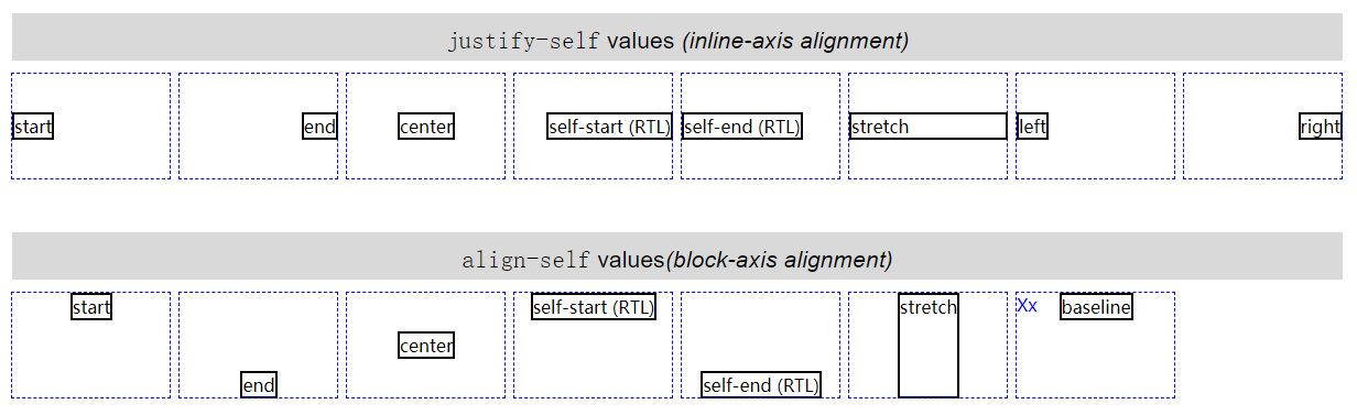
7.2 xxx-items
justify-items(横向)和align-items(纵向)是针对网格容器中所有网格元素而言的(但是设置在网格容器上),可以使用xxx-self进行单个覆盖,也就是说xxx-self的取值也适用于xxx-items。
7.3 xxx-content
justify-content(横向)和align-content(纵向)是针对网格容器中所有网格单元而言的,一般用于网格单元总空间小于网格容器时(剩余空间)。它们共同拥有 6 个值:
start:默认值,让所有网格单元按照横轴的起边对齐,也就是让剩余空间全部放到横轴的终边。受到网格容器的direction: xxx;影响end:让所有网格单元按照横轴的终边对齐,也就是让剩余空间全部放到横轴的起边。受到网格容器的direction: xxx;影响center:让所有网格单元在横轴中间对齐,也就是让剩余空间放到横轴两边,网格单元之间不留空隙。space-between:网格单元之间的空间会相同,第一个网格单元与 start 之间不留空隙,最后一个网格单元与 end 之间不留空隙。space-around:网格单元之间的空间会相同,第一个网格单元与 start 有空隙而其数值是网格单元之间空隙的一半,最后一个网格单元与 end 有空隙而其数值是网格单元之间空隙的一半。space-evenly:网格单元之间的空间会相同,第一个网格单元与 start 有空隙而其数值就等于网格单元之间的空隙,最后一个网格单元与 end 有空隙而其数值就等于网格单元之间的空隙。
justify-content(横向)独有left和right属性(align-content没有这两个值),不受到网格容器的direction: xxx;影响。
html
<html>
  <head>
    <style>
      body {
        width: auto;
      }
      .grid {
        display: grid;
        border: 1px solid;
        grid-template-rows: 45px;
        grid-template-columns: repeat(5, 96px);
      }

      h1 {
        margin: 13px 0 0 2px;
        padding: 0;
        text-align: center;
      }
      h1 code {
        font: 16px monospace, serif;
      }

      #g1 {
        justify-content: start;
        direction: rtl;
      }
      #g2 {
        justify-content: end;
        direction: rtl;
      }
      #g3 {
        justify-content: center;
      }
      #g4 {
        justify-content: space-between;
      }
      #g5 {
        justify-content: space-around;
      }
      #g6 {
        justify-content: space-evenly;
      }
      #g7 {
        justify-content: right;
        direction: rtl;
      }
      #g8 {
        justify-content: left;
        direction: rtl;
      }

      span {
        border: 1px dashed;
      }
      div[id] span[class*="box"] {
        box-sizing: border-box;
        background: hsla(117, 50%, 50%, 0.25);
      }

      span[class*="01"] {
        grid-row: 1;
        grid-column: 1;
      }
      span[class*="02"] {
        grid-row: 1;
        grid-column: 2;
      }
      span[class*="03"] {
        grid-row: 1;
        grid-column: 3;
      }
      span[class*="04"] {
        grid-row: 1;
        grid-column: 4;
      }
      span[class*="05"] {
        grid-row: 1;
        grid-column: 5;
      }
    </style>
  </head>
  <body>
    <h1><code>justify-content: start</code></h1>
    <div class="grid small" id="g1">
      <span class="box01"></span><span class="box02"></span> <span class="box03"></span><span class="box04"></span>
      <span class="box05"></span>
    </div>
    <h1><code>justify-content: end</code></h1>
    <div class="grid small" id="g2">
      <span class="box01"></span><span class="box02"></span> <span class="box03"></span><span class="box04"></span>
      <span class="box05"></span>
    </div>
    <h1><code>justify-content: center</code></h1>
    <div class="grid small" id="g3">
      <span class="box01"></span><span class="box02"></span> <span class="box03"></span><span class="box04"></span>
      <span class="box05"></span>
    </div>
    <h1><code>justify-content: space-between</code></h1>
    <div class="grid small" id="g4">
      <span class="box01"></span><span class="box02"></span> <span class="box03"></span><span class="box04"></span>
      <span class="box05"></span>
    </div>
    <h1><code>justify-content: space-around</code></h1>
    <div class="grid small" id="g5">
      <span class="box01"></span><span class="box02"></span> <span class="box03"></span><span class="box04"></span>
      <span class="box05"></span>
    </div>
    <h1><code>justify-content: space-evenly</code></h1>
    <div class="grid small" id="g6">
      <span class="box01"></span><span class="box02"></span> <span class="box03"></span><span class="box04"></span>
      <span class="box05"></span>
    </div>
    <h1><code>justify-content: right</code></h1>
    <div class="grid small" id="g7">
      <span class="box01"></span><span class="box02"></span> <span class="box03"></span><span class="box04"></span>
      <span class="box05"></span>
    </div>
    <h1><code>justify-content: left</code></h1>
    <div class="grid small" id="g8">
      <span class="box01"></span><span class="box02"></span> <span class="box03"></span><span class="box04"></span>
      <span class="box05"></span>
    </div>
  </body>
</html>
以上代码效果图: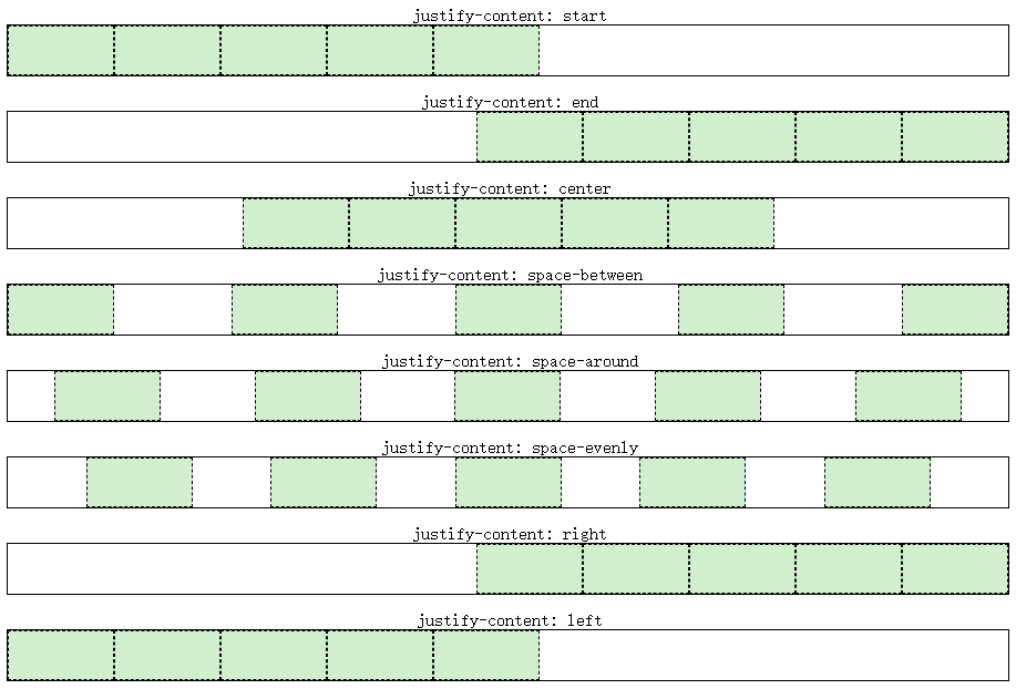
八、分层和排序
在4.4 元素重叠以及异常处理就出现了元素重叠的现象,它们的重叠顺序是根据网格元素原码顺序而来的,是可以通过传统的z-index进行更改,也可以通过order进行网格元素顺序的更改以达到改变重叠顺序的目的。
order属性设置在网格元素上,用于更改网格元素的顺序,但是如果使用grid-row或grid-column等进行强制的网格元素添加,order会失效。也就是说order一般用于网格流上。
默认情况下,所有网格元素被分配为“0”的顺序。网格元素的order为负值时,将会显示在默认值“0”之前;网格元素的order为正值时,将会显示在默认值“0”之后。如果一些网格元素的order相同,则按照源顺序显示。
html
<html>
  <head>
    <style>
      #grid {
        display: grid;
        width: 80%;
        height: 9em;
        border: 1px solid;
        grid-auto-flow: column;
        grid-columns: repeat(5, 1fr);
      }
      span {
        border: 1px dotted red;
        margin: 3px;
      }
      span[class*="box"]::before {
        content: attr(class);
      }
      .box02 {
        order: -1;
      }
      .box03 {
        order: -2;
      }
      .box04 {
        order: 1;
      }
    </style>
  </head>
  <body>
    <div class="grid boxed lines" id="grid">
      <span class="box01"></span>
      <span class="box02"></span>
      <span class="box03"></span>
      <span class="box04"></span>
      <span class="box05"></span>
    </div>
  </body>
</html>
以上代码效果图: